Redesign exploration with Cursor
I have been getting a bit bored of the design for my website and I thought it would be a good opportunity to see how Cursor would deal with a design challenge using the Opus 4.5 model.
I gave it the following prompt:
I'm kind of bored of the look and feel of this website.
Can you review the code and come up with a new design.
Here are some example websites I like:
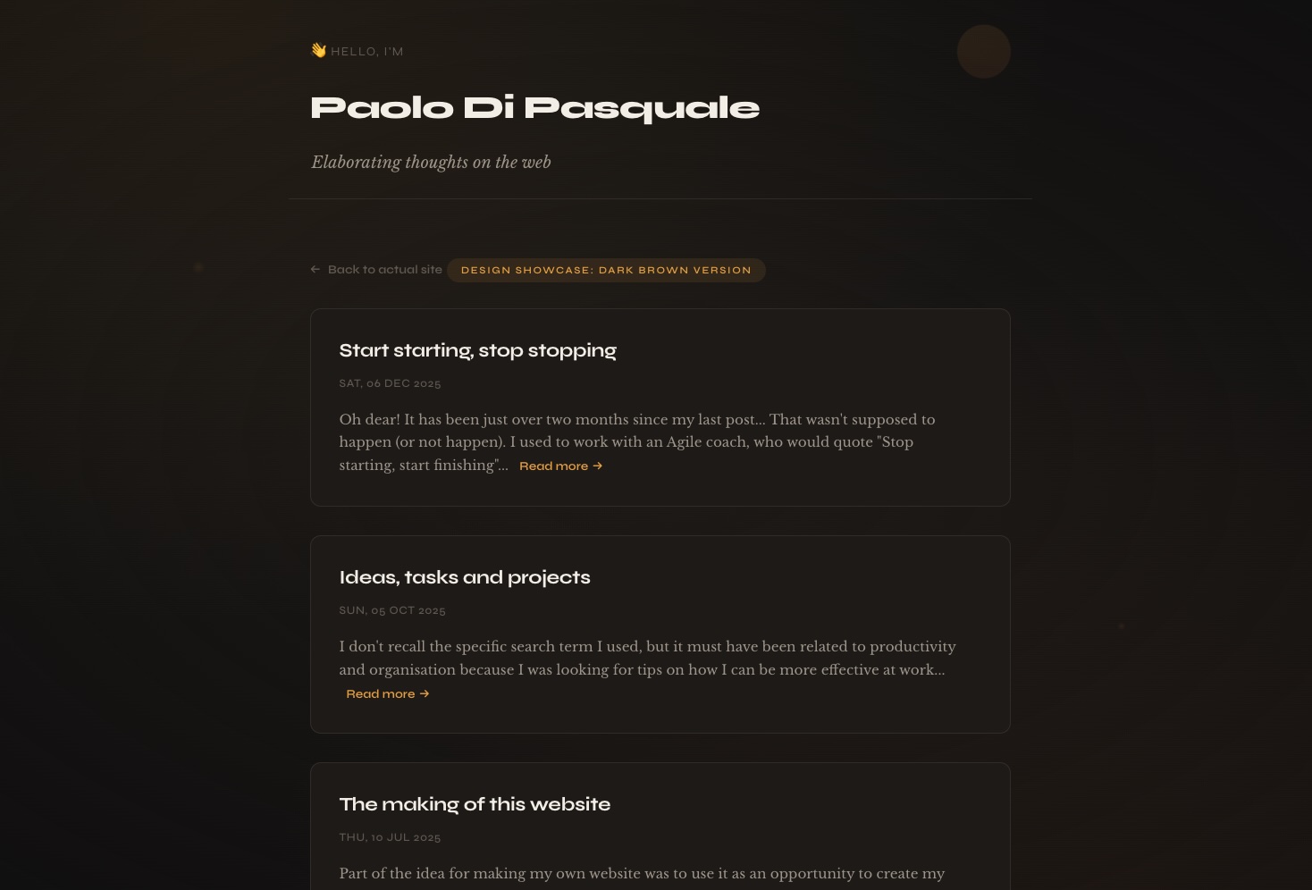
Although the first design was truly repulsive, within a minute or two, Cursor had rebuilt my website with a completely new design as shown in this page and the screengrab below.

I threw another prompt at it to generate another design idea:
Cool that's a nice option. I have commited that so we have a snapshot of that design. Can you generate another variation?
Here's another website I like: https://www.cassie.codes/
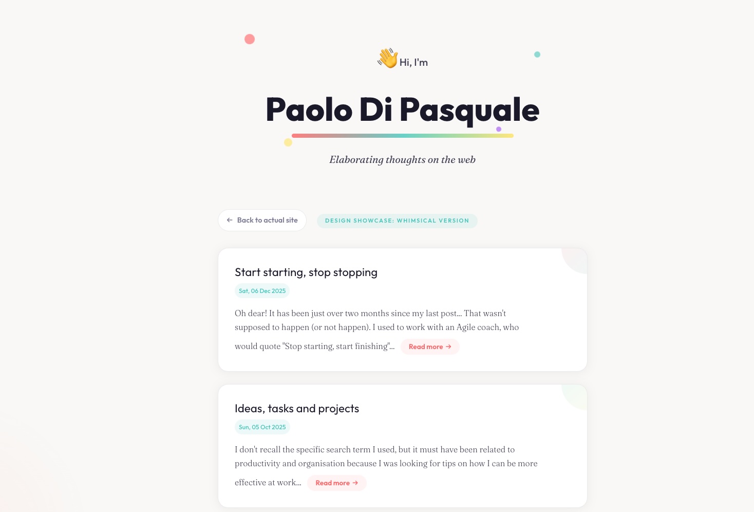
The next attempt was actually quite nice and more along the lines of the whimsical effect I was going for. Here is the page and the screengrab below.

There were already a few ideas that I liked from these iterations, but I asked for another one for good measure.
That was really cool! I just want one more idea so that I can pick the best parts of all three.
Can you get some inspiration from this website for the next one: https://www.windowsofnewyork.com/
But keep the whimsical traits from the previous iterations.
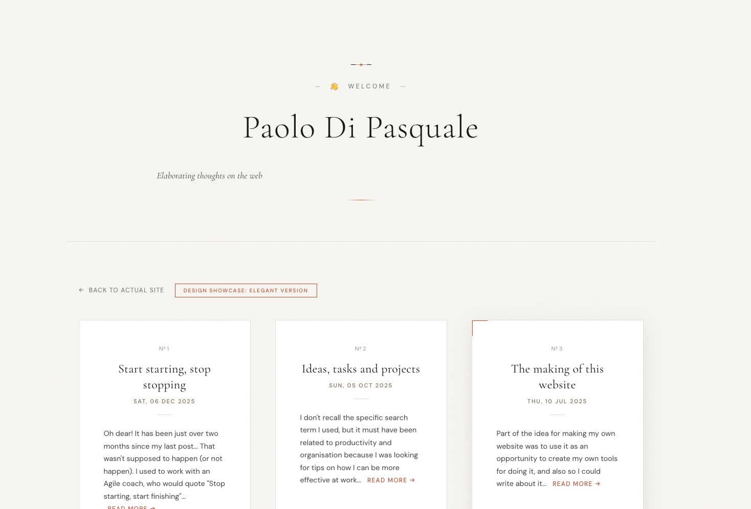
Here's the page for the last iteration and the screengrab below.

This was the first time I have used Cursor to try out some UI design ideas. In my day-to-day work, I'm using it to change infra settings in terraform or fixing issues with data analytics so it was quite refreshing to use it in this way and I think there are some interesting ideas here that I can use in the design for my actual website too 🙌